Friday, December 20, 2013

The kindness of King County Library System

King County Library Service twitter discussion
I came across a mention of a new app from King County Library System.  It is an app which records how much you read - as a motivation.

When I first checked it out, it was only available for people in the USA, but still the library staff were very kind in their comments to be via twitter.

The app is now available for people all around the world to use, and it is lovely.

 ---

Added 21 December 2013 To show how lovely they are - they sent this tweet

Thursday, December 19, 2013

HerdyShepherd on twitter

I came across the HerdyShepherd account on twitter from reading an article in The Atlantic (article here) thanks to it coming through my reading on Zite.

Since then I have been following HerdyShepherd  on twitter.   Recently one of the tweets from the account looked for some indicative numbers on who actually looks at the tweets.
This account has over 19 000 followers.  In all likelyhood each person will not see each tweet.  I realise this is broadly indicative data, but I still thought it was an interesting method to use.  Looking at the statistics on the photograph, almost 70 retweets and almost 2000 favourites, it looks like a decent percentage of followers see each tweet, or at least see a percentage of tweets.  I liked the way this broad indicative data was used.

Connect with publishers online

Book promotion by ellen forsyth
Book promotion, a photo by ellen forsyth on Flickr.
This was a recent promotion at Wynyard Station for the new Ian Rankin title. The publisher was making it easy to connect with them on twitter and facebook. I know this is hard to see in the photograph, but on the billboard size poster in the station it was easy to read. Does your library make it easy to connect on social media?

I liked this promotion because it is an offline promotion about something online. I may not have thought to check the publisher out online. It would have been nice to have been told about Ian Rankin being on twitter, but I am already following him.

If you have not read this book, it is an entertaining read.

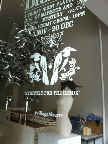
Hashtag - make it easy to share

Hashtag by ellen forsyth
Hashtag, a photo by ellen forsyth on Flickr.

I like the way it is made easy to share online about the pre-Christmas markets at the Rocks. They are encouraging people to connect online with the discussion. I like this.

Saturday, November 30, 2013

Guardian witness

I missed hearing about the Guardian witness site until recently.  This is where they ask us to share stories which they might use in news.  This would seem to have amazing local studies potential, if a library set this up, or it could be a collaboration.  I will have to explore it more, but it is interesting to see what people are contributing to the different story/reporting areas.  Go and have a look at it.  I also like that all the stories/reporting can be shared to social media (painlessly).

This is what The Guardian says about the site
GuardianWitness is the home of user-generated content on the Guardian. You can contribute your video, pictures and stories, and browse all the news, opinions and creations submitted by others. Posts will be reviewed prior to being published on GuardianWitness, with the best pieces featured on the Guardian site.

Monday, November 25, 2013

Teen games rule

This is a new book which I co-edited with Julie Scordato.

We have set up a tumblr for people to add their stories of games and teenagers.

It has been very interesting working on this as Julie and I have not met in person, but have used a range of online tools to work together.

The authors are from Australia, Finland and the USA, and are all very skilled at what they do, offering impressive programs, services and collections around games.

We could not fit every great story in the book, which is why we have set up the tumblr, so that you can all share your great stories of games with teenagers with others.  We are using #teengamesrule to bring these ideas together.

Just in case you are wondering, this is a project which Julie and I did outside work time.

Saturday, November 9, 2013

Imagining reading...

I overheard a conversation where two people were discussing reading.  I was interested because of the readers advisory work which I do.  This discussion had one person making suggestions to the other as they both liked crime novels.  The person receiving suggestions said they liked an immersive read, so 'of course' detailed descriptions of setting were the most important area.  This interested me at the time, as the authors and titles being described did not strike me as having particularly detailed descriptions.  I enjoy Henning Mankell, but do not find his books heavy on description of setting (unless in a way which is necessary for the story).

In readers advisory work it is really important to remember that other people will see  the same read differently to us.  The 'of course' setting was the only way for an immersive read was also stark (yet interestingly they were only interested in real world descriptions, no speculative fiction).  Of course it isn't the only way for an immersive read, but obviously it was the only way this person could immerse themselves in reading or imagine anyone being able to immerse themselves in reading.  We all immerse ourselves differently, in different degrees and depending upon individual titles.

This highlights the importance of imagination as part of the mix of skills, training, experience, research, use of tools and other aspects of providing an effective readers advisory service.  It is not about what or how we read, but about what and how our clients read, and we have to be able to imagine that people read differently to us, and can have a rich and rewarding reading experience by doing so.  The conversation I heard showed someone who could not imagine anyone having a satisfying reading experience unless other people read in exactly the same way as they do.

Just in case you are wondering about my evesdropping.  It was in a public place and loud enough to hear at a distance.

Tuesday, October 8, 2013

Dolly the reading pig at East Baton Rouge Parish Library

I recently came across the social medial work being done by East Baton Rouge Parish Library. You can see the links to the various sites down the side of their website. I also like the way they are using cross promotion - for example of Instagram on their Pinterest boards, and their Poe-terest board to help promote their one book one community series. I think that board is impressive (and not just because of the wonderful name). I have embedded the image of the reading big - just for sheer joy.

Monday, October 7, 2013

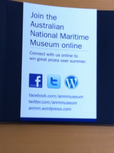
How to connect with the National Maritime Museum

Apologies for the dodgy photograph. You can still see the way the National Maritime Museum wants people to connect with them. Great to see this promotion in the museum.

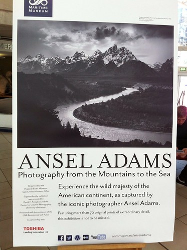
Connecting with exhibition at the National Maritime Museum

Lovely to see the way the National Maritime Museum is encouraging interacting with an exhibition - and there was an Instagram competition as well.

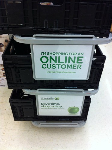
Online shopping - instore promotion

Online shopping by ellen forsyth
Online shopping, a photo by ellen forsyth on Flickr.

I saw this recently at the supermarket. I like the way it explains what the staff member is doing, but also is a promotion for another way to shop.

Social media information for #artandabout

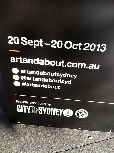
I have really been enjoying the way it is so easy to connect with Art and about via social media. I like the way that there are pillars and signs near the various artworks telling me how to connect. They don't expect me to go to a website, but are telling me while I am at the place I may want to take a photograph of and share online, or tweet about. This is impressive, but we should see more of it too.

Wednesday, September 25, 2013

Library instruction videos

There is an increase in library instruction videos.  The ones shown below from the British Library and the National Library of Australia are two excellent examples.  I like the way the libraries are promoted, and the way the information is conveyed.  It is also good to see the way collection items are shown too.

From the British Library
From the National Library of Australia
You can see more British Library videos here, and more videos from the National Library of Australia here.

Tuesday, September 24, 2013

Formats of reporting

While following the current news story about the hostages in a mall in Kenya, I noticed this report from CBS.  It is interesting because of the way social media is included in the reporting of the situation.  The tweets are shown as quotes.

I have not seem much of this kind of reporting from libraries about their collections, although the British Library has used used social media as part of their story telling.  You can see recent tweets on their home page, and exhibition pages often have an embedded feed of recent tweets using the exhibition hashtag.


Sunday, September 22, 2013

Fight dengue

Fight dengue by ellen forsyth
Fight dengue, a photo by ellen forsyth on Flickr.

This was a nice health promotion in Singapore. You could scan a QR code, connect on Facebook or Twitter.

Follow a shop on social media

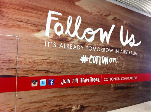
This was covering a shop fitout. It was a great way to promote the shop that would be there, and who wants to connect to its clients via social media. I liked that the sign was really big.  They also make their hashtag visible too.  How easy is it for people to find the hashtag for your library exhibitions, are they in the exhibitions, or do people have to guess?  Do you have hashtags for exhibitions, or to encourage people to talk about your library online?

Download a shop app

Download a shop app by ellen forsyth
Download a shop app, a photo by ellen forsyth on Flickr.

How easy is your library app to find online. Do you make it easy, or do you expect people to be really effective searchers before they can connect.

This vegetarian cafe makes it simple, as they want their clients to connect with them.

Virtual reality resurrects a defunct exhibition - tech - 27 August 2013 - New Scientist

Virtual reality resurrects a defunct exhibition - tech - 27 August 2013 - New Scientist

This is a rather brilliant idea, and a great way to preserve history of museums, galleries and archives.  Make sure you read the New Scientist blog post.


Saturday, September 21, 2013

Celebrating social media - at South Sydney

South Sydney, the rugby league team, celebrate their fans who follow them on social media.  They have a club twitter account @SSFCRABBITOHS which they use like other organisations.  They also have a page on their website which celebrates how their fans are showing their support for the club and the team, on twitter.  You can look at the leader board of tweeting fans - with links to their twitter accounts, just in case you want to follow them.  They also profile some of their twitter supporters (social fan of the week) and often feature a key tweet on their home page (which many libraries and other cultural institutions also do).  I like the profiling of the twitter fans as it is a way of both celebrating and building community.

Other sports teams may also feature this kind of community celebration, so please treat this as an example.  I liked the way they are bringing the social media to anyone who uses their website.  They are celebrating this kind of support for their team, as well as much more traditional means.  It is about building and connecting to their community of fans, and celebrating them - and I think there are ideas for libraries in this.  They even have a weekly wallpaper featuring different key events and players of the previous week.  It would be lovely if people were so excited about library collections that they wanted to show this by having a different library (museum, gallery or archive) wallpaper on their screen each week.

Thanks to @cfwriter for telling me about this.

It only seems polite to end this post with - #GoRabbitohs

Friday, September 20, 2013

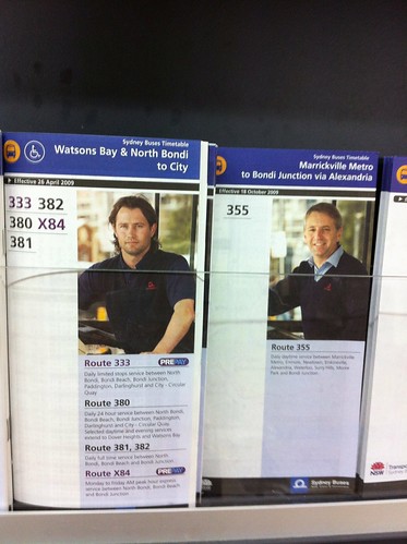
Bus timetables have become...different

Bus timetables by ellen forsyth
Bus timetables, a photo by ellen forsyth on Flickr.
I had not looked at printed bus time tables for a while and was interested to see that actual bus drivers were now being featured on them. This is an interesting development as it appears to be personalising the information. I don't know how long this has been happening, but it is an interesting development.

Sunday, August 25, 2013

The knitting reference library at the University of Southampton

The University of Southampton library includes the Knitting Reference Library.  It contains collections gathered by Richard drug, Montserrat Stanley and Jane Waller.

You can find out more about it from the library web site.  It includes some digitised works, so could be of interest to library clients doing knitting related research, 
or looking to explore heritage knitting in a different way.  They also have a blog. It could be interesting 
information to show any knitting groups who meet in  your library.

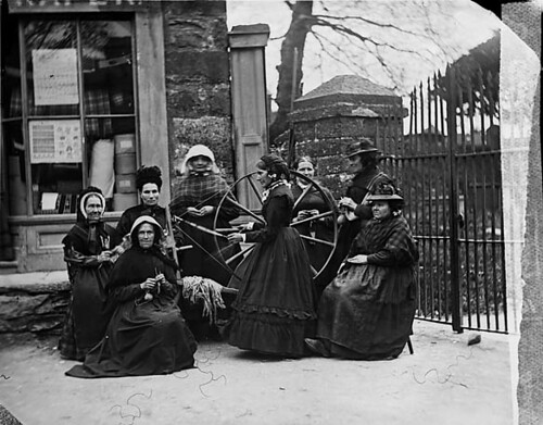
Capel Garmon natives I came across this information while reading Rowan 54.

Reading about this reminded me that many libraries, for reasons of legal deposit, or historic collecting practices  would contain materials relating to knitting, crochet and woodwork, but these were often not receiving the same publicity, except rarely, as many other digitised materials.  I really liked that the University of Southampton is valuing this part of the collection.

The newspapers on Trove Australia can also be a useful way to research knitting.There is knitting research and discussion about knitting research taking place, and these online resources help.

Wednesday, August 7, 2013

"You can't force art" or writing? Really?

I have just read an excellent post by Chuck Wendig called "you can't force art".  Follow the link to his post before you read further.  The post by Mr Wendig is nsfw.

I had been thinking about doing more writing, to improve it.  It is an area I struggle with, so reading this post today reminded me that I have to work at it.  I knew this, but the reminder still helps.  Mr Wendig is talking about creative writing, but I am going to apply the skills to my writing which is library related.  I have not sat around waiting for inspiration (as that would rarely work), but I have procrastinated (which is not quite the same thing), so I will be working on reducing my procrastination as well as increasing my writing.  When I work regularly at writing, it does work.  I write more, and I think about writing more, and it helps my ideas in a whole range of areas.  This is not so much about the report writing and other writing I do at work as part of my work.  This is more about papers, and blog post ideas.

This does not mean there will be a blog post every day, but there may be a few more.

Saturday, August 3, 2013

Mapping reading

I have just found out about this website, called Placing literature : where your book meets the map.  I really like (as in really really like) the concept.  I have a minor quibble with the name, but that is all.  I will assume that the setting location of any novel can be mapped (not just works of fiction which are described as being literary or as being literature).  I think it would be great to see all the urban fantasy mapped against the location it takes place in.  We need Chuck Wendig mapped in New York, and Paul Cornell in London.  We also need Anne Gracie's romance titles mapped in their various locations, and Cassandra Claire and Jennifer Crusie showing up as well.  I have not checked the map in detail for these, and all the sites I have looked at so for fit in "literary", but I would hope that works by these authors would be welcome.

I have noticed that some non-fiction is being mapped as well - Pepys diary has made its way in (but maybe that is a clever comment about diaries being our own personal fiction?)

It is a great site - and a big thank you to the people who have created it.


View International Crime Fiction Map in a larger map

Another mapping of location is the International Crime Fiction map (via @cfwriter).  So this might mean if you are mapping crime fiction you may want to include it on both maps.

Sunday, July 21, 2013

Does your library, museum or organisation publish new photographs under Creative Commons?

I am asking this question because I have just been looking at a post called San Diego Comic-Con (SDCC) 2013 in Pictures: The Creative Commons Edition [Gallery] which as part of the article says "Please note that all the pictures you see below are licensed under a Creative Commons license"

You can read more at http://www.geeksaresexy.net/2013/07/20/san-diego-comic-con-sdcc-2013-in-pictures-the-creative-commons-edition-gallery/#YIM1oLypQO5l877y.99 "

I like the way it is making it really clear that these images (and not other images) published on this site are Creative Commons.  I have also noticed, when I copied the article title it automatically added an attribution,which is exactly the text shown just below this.

San Diego Comic-Con (SDCC) 2013 in Pictures: The Creative Commons Edition [Gallery]
Read more at
 http://www.geeksaresexy.net/2013/07/20/san-diego-comic-con-sdcc-2013-in-pictures-the-creative-commons-edition-gallery/#YIM1oLypQO5l877y.99 


I have added the blue as a highlight.  This is also a nice feature as it makes the attribution easier. 

It also prompted the question, how would your library, museum or organisation respond if someone looking like some of these people, came into your library?  Hopefully they would have a great library experience, and not be asked to leave. 

Tuesday, July 2, 2013

Free wifi at the QVB

Free wifi at the QVB by ellen forsyth
Free wifi at the QVB, a photo by ellen forsyth on Flickr.

I like this sign. It was clear. It told me something I did not know. There is helpful small print at the end of it saying there is a one off registration - so they were being helpful about something which may present a problem. The small print is not so small you can not read it while still walking, no so large that it dominates the sign.

Sunday, June 30, 2013

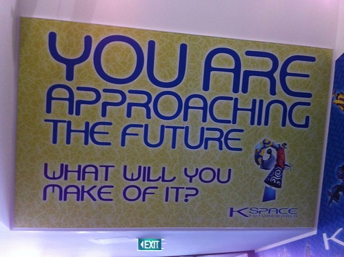
You are approaching the future...

Thinking about the futureThis sign is at the National Museum in Canberra.

This is one of my favourite museums.   They have really really interesting exhibitions, an excellent permanent exhibition and an amazing building.  I think the building builds excitement as you walk towards it seeing the curve of orange towering above you.  There are lovely views over the lake as well.

This sign is on the way to part of the museum.  I thought it was asking an excellent question for the end of blogjune.  I thought it was suggesting a proactive rather than a passive approach to the future.  It is also suitably ambiguous as we all make and are made by our environments.  It seems to require conscious action.

It has been another fun blogjune. I am still catching up with lots of fabulous posts written by many amazing people - so part of my future will be reading more blogjune posts.

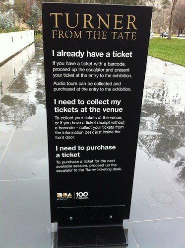
I already have a ticket...

Message about ticketsThis sign is at the National Gallery in Canberra.  It is about their current exhibition which is well worth seeing.

They had more complex information to convey, but it broke into three parts - hence the bigger writing on the sing.  This meant that you did not have to read the whole sign, just the part which related to your circumstances.

They were saving your time and giving you the information you needed, easily.  There were several of these panels on the way in, so which ever way you approached the gallery you were likely to see them.

I was interested that none of the signs had social media connections, but perhaps I missed them.

The signage for the exhibition was excellent.

Friday, June 28, 2013

Put your sign where it matters

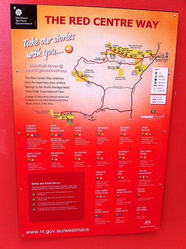
Podcast information This sign is encouraging people to download podcasts about the western MacDonnell Ranges, and other national parks in the Northern Territory.  This sign is in a location with mobile coverage.  This is really sensible.

Many national parks do not have mobile coverage and it would be really irritating to see this sign in one of those places.
Seeing it where there is mobile coverage, so you could actually download the podcasts is excellent.

Do you have any signs designed to irritate?  Or are they like this one, in the right place and even including the url to make it really easy to find the podcasts?

It worked well as a promotion to, letting people know about different places they could go in national parks.

You can see the links to the stories here. (Note there are a few issues about the names of the stories).

I also like the sharing element.

Thursday, June 27, 2013

Is the sign big enough?

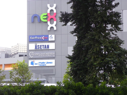
Serangoon Library, Singapore This example was taken from the train station near the Serangoon Library.

This sign was readable so that it was clear that the library was in the shopping centre.  It made it very easy to find.


Wednesday, June 26, 2013

apple sign

Apples I really like this sign. I like it so much that I have blogged about it before. I think it is a great way to let people know about different apple types, and to encourage people to try some different ones.  It does not list all apple options, but a range.

It has simple to read graphics and gives useful to read information about apple without being overwhelming.

It is a very nice example of keeping a sign simple.

Tuesday, June 25, 2013

signs to explain services

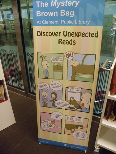
Clemeti Library Sometimes new services may need an explanation.  This sign in Clementi Public Library in Singapore used images and limited text to explain a services which provides surprise reads.  The service is a nice idea, as is the sign to explain it to people who may not be sure about borrowing a brown bag (with a book in it) from the library.

Monday, June 24, 2013

Are you sharing your library mission?

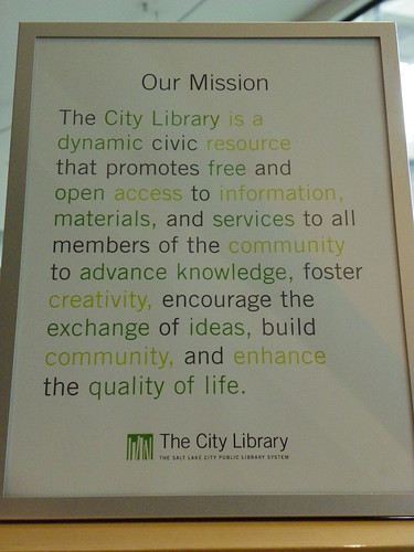
Library mission - Salt Lake City Public Library, Main Library, Utah This is from Salt Lake City Public Library.  They want people to know the parameters of their library service, and use the library mission statement to make sure people know the expectations upon the library service.

This is an interesting way to tell part of the story of the library.

Sunday, June 23, 2013

Does your sign blend in?

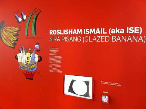
QAGOMA APT7 Sometimes the purpose of the sign is to be part of the scenery.  This was a temporary sign at QAGoma. It was part of one of the art works, and was connecting the cafe to the exhibition, but having part of an art work in the cafe, which also operated as a sign.

This was an interesting way of looking at the signs for the exhibition, and of drawing the cafe in to it as well.

think about the language of the sign - should it be in a language other than English

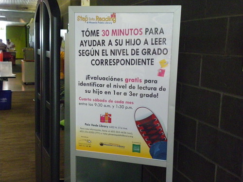
Reading promotion - Palo Verde Library Many of your library signs will be in English (or whatever is the main language spoken where your library is).

It may be really important to have signs in languages other than English so that the information reaches the target client group.

This serves a few purposes.  It lets people know you  have services they may be interested in, in their first language.  It also lets people know that you are interested in providing a service in another language and tells the community this.

This sign was in a library where the first language of much of the community is English, however, there are also many people for whom Spanish is their first language.

Friday, June 21, 2013

more connections

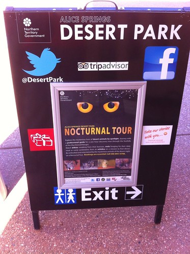
How to connect with the Desert Park at Alice Springs A constant theme in this blog is how can people connect to your organisation, and how can they find out about how to do this.

Social media connections should be listed (in an easy to find way) on the web site.  As they are for the Alice Springs Desert Park.

They also need to be listed on site, as maybe someone has not used your website, or maybe they did not care about connecting until they were onsite.

I was impressed by this sign.  It promotes events coming up, but also lets me know three ways I can connect with the park (as well as where the toilets are).  All important information.  It evens mentions the funding authority (always a good idea).

Do you make it as easy as this for people to find you on social media, when they are in your library?

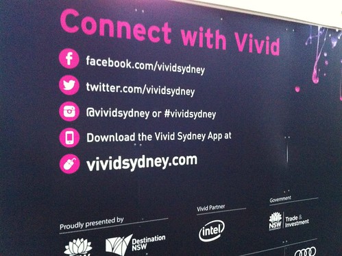
This is something Vivid did really well - as you can see below.

How to connect with #vividideas They wanted you to connect and they were making it very easy to do.

Thursday, June 20, 2013

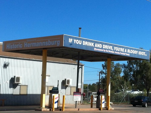
another blunt sign

Sometime signs need to be blunt - at Hermannburg The local football team was sponsoring this sign.  What more needs to be said.

Wednesday, June 19, 2013

using signs to tell stories

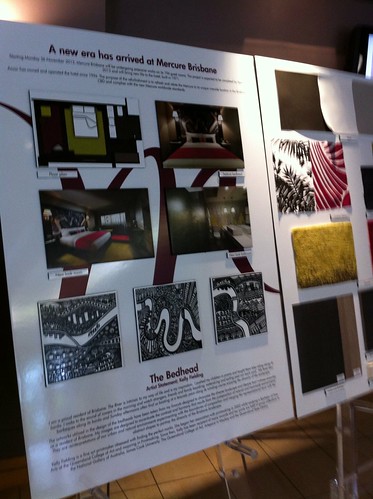
Telling a story of refurbishmentThese panels were in the foyer of a hotel in Brisbane.  They were telling the story of the refurbishment of the rooms, as well as letting you know the colour scheme.

The fabric panels above the beds were stylised maps of the Brisbane River and its path through the city.

I think this information served a few purposes.  It was letting people know, while they were still in the hotel foyer, that the rooms were refurbished.

It was also telling the story of Brisbane.

This hotel had river views from many rooms, and they were helping visitors connect from where they were staying, to the city.  It was impressive looking at the artwork of the river and then looking out at the river and city.

I liked this idea for a few reasons.  The refurbishment was nice, but I really liked being told the story about it as well.  It helped me further connect to the environment.


Tuesday, June 18, 2013

Be as blunt as you need to be

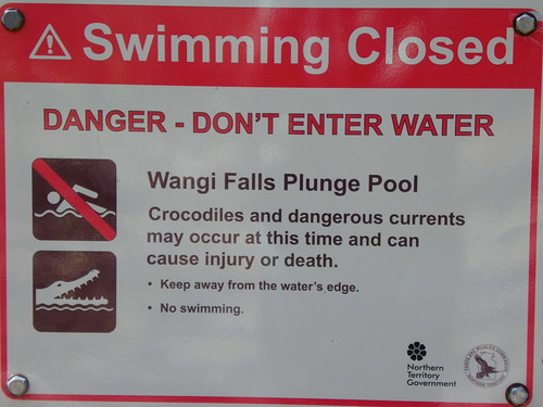
Crocodile sign Litchfield National ParkVisits to libraries should not be life threatening.

Visits to national parks may be, because of wildlife and because of people not taking the environment into account.

This is a friendly and blunt sign from Litchfield National Park, NT.

It is blunt, and it needs to be.

Have you looked at what your signs are actually saying?

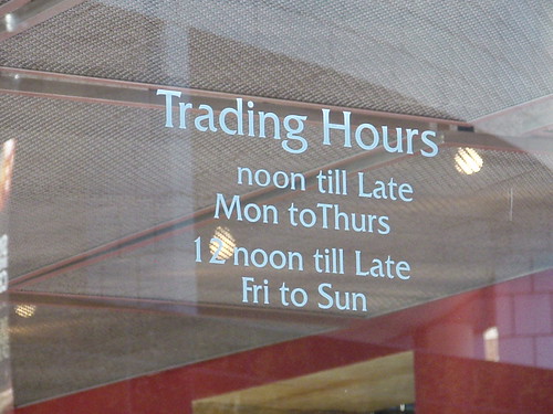
Trading hoursThis sign, on a business in Sydney, provides the hours of opening.  When I saw it I kept looking at it, trying to work out what was being said.  Is there something I am missing?

It is saying the same thing in a confusing way.

Wouldn't it be easier to read if it simply said noon (or 12 noon) til late 7 days?

Have a look at your signs and see if they are saying what you really think they are, or are they initially confusing like this one.

Sunday, June 16, 2013

Is the sign clear?

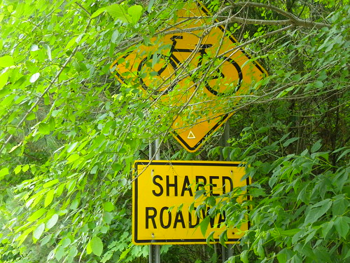
Shared roadway I like this photograph.  It highlights the problems with some signs.

They may be in the wrong place.  They may need work done to highlight them.

This needed some tree trimming to really make the point that it was a shared roadway.  It looks a little begrudging about sharing anything the way it currently looks.


Saturday, June 15, 2013

Abiguity

Sleeping in public This sign was at the University of Canberra.

I am not completely sure what it means, but I think it still works.

It could mean 'don't be really noisy because students may be sleeping".  It could be an invitation to sleep, or it could be a sign of humour.

Friday, June 14, 2013

Reading pleasure ?

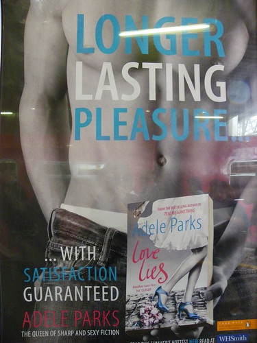
Poster on the London Underground This is an interesting promotion for a romance novel.

It is eye catching, and making obvious word plays - I laughed out loud when I saw it.

Is this kind of promotion too racy for a library to consider?

Looking at it, could not titles by Neal Stephenson and George R R Martin be advertised as "longer lasting pleasure" because of the amount of time they take to read.


Thursday, June 13, 2013

A sign with a motivation

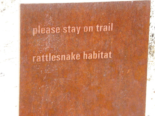
Sign at Deer Valley Rock Art Centre I like this sign. It provides its own motivation for staying on the trail.

It is interesting that there are few snake warning signs in Australia.  Maybe because many snakes are shy, or perhaps because people really don't want lots of freaking out.

Wednesday, June 12, 2013

My favourite sign

Agave Library I think this may be my favourite sign - ever.  You can see it at a distance when you are approaching the library.  It gives a sense of excitement, and adventure.

The sign is lovely, with agaves growing around it as well.

At certain times of day it also operates as  dappled shade for the outdoor library space behind it.

How does your library sign make people feel?

Tuesday, June 11, 2013

Hazard signs

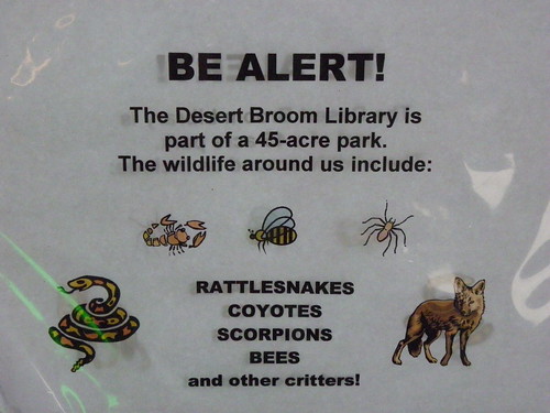
Wildlife alert -  Desert Broom Library This library obviously has some wildlife around.  This sign is an interesting way to let people know that it is a shared space, and to show a bit of caution.

Monday, June 10, 2013

Do you tell your community how their library is funded?

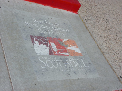
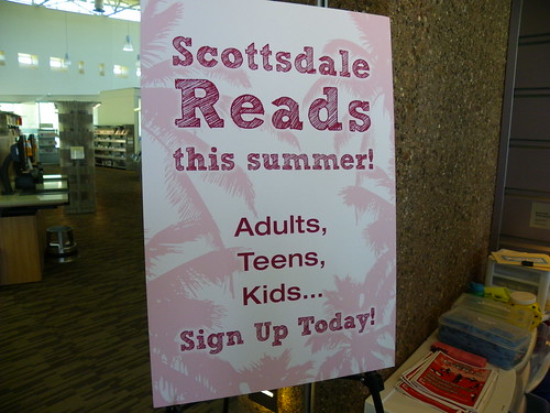
"Spending in Scottdale support this library"  - Arabian Public Library I like this painting on concrete because it helps the community to understand how their library is funded, or a least part of the story.

How do you inform your community about library funding?

Sunday, June 9, 2013

summer reading - for everyone

Summer reading promotion - Appaloosa LibraryI I really like this sign because it is a summer reading program for everyone, or at least everyone in the community can take part in different parts of it.

Is your summer reading program going to be inclusive next summer?

Saturday, June 8, 2013

Enjoy failure - kind of...

I never thought I would write a post with this heading, but that was because I was not thinking about failure the right way.

Several months ago I realised that I tweet about it being okay to talk about failure, but realised I don’t often talk about my failures, and realistically they happen every day.  People around me know this, just as I know their failures.   

JK Rowling puts it really well, (and here is the complete text of the talk) and you can watch the video below


Wil Wheaton has some impressive things to say about failure too, and Scott Higgins is also helpful.

In a recent talk Neil Gaiman said "When the rules are gone you can make up your own rules. You can fail, you can fail more interestingly, you can try things, and you can succeed in ways nobody would have thought of, because you're pushing through a door marked no entrance, you're walking in through it. You can do all of that stuff but you just have to become a dandelion, be wiling for things to fail, throw things out there, try things, and see what sticks. That was the thrust of my speech," 

You could stop reading and watching here. 
"Ever tried / Ever failed / No matter / Fail again / Fail better" Samuel Beckett, inspiración de @teamlabs

I am talking about failure now, as part of my learning about it, but also to make it easier for other people to talk about too.  Sounds a bit like I am talking about an addiction, but rather I think the addiction is not talking about failure, and about not admitting to failure, and about not admitting that we all fail, often. Failure is not always something enjoyable to live through, but on the other hand it can be liberating.  

You can fail and still do amazing things, and you can do amazing things because you fail at what you set out to do, provided you have the right attitude.  I still delivered on a lot in Timor Leste and in some unexpected areas there, however, there were other ways I failed.  Once I realised I was going to fail, and I have to admit there were a few crunch moments about this (it was not pleasant), a different part of my brain clicked in as I sought to problem solve my way through this.  This was really exciting, and it meant I was actually thinking differently, I really could also feel it happening in my brain.  Part of this was thinking more creatively, there was more desperation in my thinking and that helped too.

I am also not saying I fail because I am a perfectionist.  I am not a perfectionist and I think perfectionism is close to evil.  I think one should strive for excellence, but perfectionism is dangerous and destroys many great and amazing things, and can really stop people thinking creatively.  

We don't have to be happy about failure, but choosing to deny failure happens is ignoring the important point J K Rowling made, and to quote her:

You might never fail on the scale I did, but some failure in life is inevitable. It is impossible to live without failing at something, unless you live so cautiously that you might as well not have lived at all – in which case, you fail by default.


Friday, June 7, 2013

"Polite line - do not get cross"

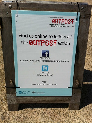
Polite line - do not crossThis photograph was also taken at Cockatoo Island, during Outpost.

It shows an art work which had a lot of people doing double takes, once they actually read the words.

It seems a good reminder about customer service (amongst other things), and that as staff we need to keep in mind the polite line, and try not to get cross.

We might be having a bad day, the person in front of us (and they may be standing there, be on the phone or online) may be contributing to it or it could be the result of something which happened earlier, even elsewhere.  It actually does not matter.  It may help to keep an image of these words show on the polite tape.  It may be enough to help you collect yourself, and be able to assist a client, or otherwise do what you need to do.

Thursday, June 6, 2013

Is your organisation easy to find online?

Social media connectionsThis shows how an event on Cockatoo Island made sure people could connect with them on social media.

There were several signs like this over the island so you knew you could connect via social media.

I really like it when an organisation or event lets me know how I can connect, if I want to.  I particularly like it when I obtain this information in context.  This information should be on the website, however, it also should be visible in the building, or in this case on the island.

I will probably have a few other photographs to share on this theme during blogjune to show where I think this is done well.

When it is done well it is easily findable.  It should also be able to be read at a reasonable distance.  This could be read while standing a short distance away.
Wednesday, June 5, 2013

Cost benefit of a library

Cost benefit of the library - Grand County Public Library, MoabGrand County Public Library in Moab, Utah makes sure that their community knows the value of their library.

It is a very impressive and well used library service.
Inside the library they have have a sign telling the community that for every tax dollar collected in property tax, the library provided over $8.00 worth of value.

This sign is telling the community that their property tax is being well spent and is adding significant value to the community.


Tuesday, June 4, 2013

Translating library terminology

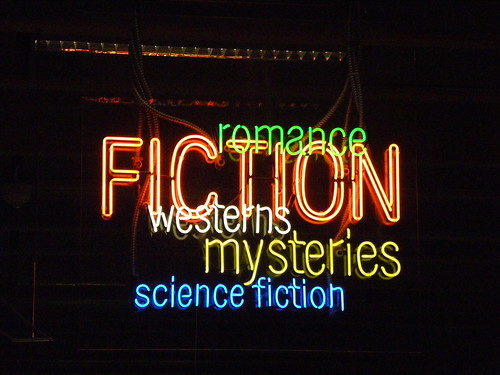
Fiction/genre sign - Burton Barr Central Library, Phoenix Public LibraryThis sign, from Burton Barr Library in Arizona is helpful for me.  I like that it does not expect me to understand what fiction is, but lets me know some of the kind of reading I might find in this area.

I think there is a sense of excitement from the kind of sign as well.  The lit sign (and I know this is not feasible for every library, not would it work in every library) adds to the sense of wonder, discovery and interest.  

I am guessing it took a while to work out the exact working (what genres get mentioned and in what order), but this sign does what it needs to do, shows where I can find some reading.

Monday, June 3, 2013

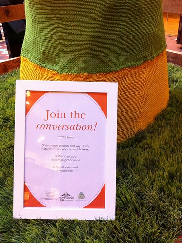
"Join the conversation"

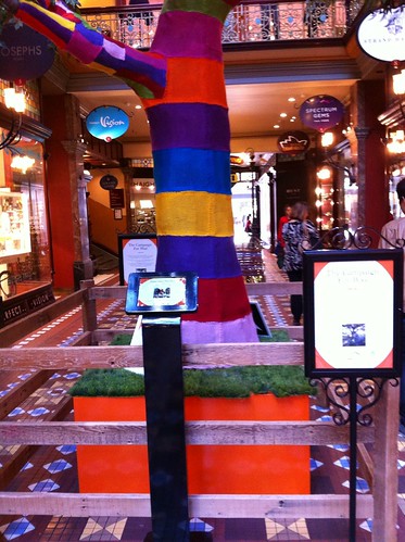
Campaign for woolCampaign for wool This was the request in the Campaign for wool in the Strand Arcade in Sydney.

The image on the left shows the different connection options, including hashtag.

The image on the right shows the broader context, and includes in ipad (centre) where more of the images could be seen.  People were being encouraged to share their photographs of the Strand Arcade via social media.  It was a nice looking promotion.

Sunday, June 2, 2013

signs on tables

Free wifiThis is a second photograph from Burwood, showing the tables in the food court.  It seemed that every second table had a wifi promotion.  I do not know how new the wifi is, but it was great to be told about it.
  
I know it is a dodgy photograph, but I was trying not to be obtrusive in what I was doing.

Saturday, June 1, 2013

I will be participating in #blogjune

Free wifiIt seems a good idea, but I know that at times during June I will struggle with the daily posts, and some may be posted one or two days later.

I thought I would focus on signage (previous years have looked at libraries I would like to visit, and sources of inspiration).   There may be posts on other topics, and thirty days of posts on signs seems scary to me (as well as any readers).

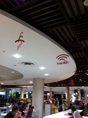
This is my starting image.  It is some of the best wifi signage I have seen, and it was in the food court of Westfield at Burwood NSW.  All around the white area, there were hanging signs saying free wifi.  While looking at these it struck me that wifi is not always as obvious in public places.

This kind of sign really puts wifi in the public toilet category - in that they both should be free, with no barriers to use (no sign in required), they should be well maintained (fast wifi, clean toilets), and they should be available in lots of accessible public places - and you should have signs telling you where they are, rather than having to guess.

Monday, May 6, 2013

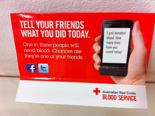
Tweet at the blood bank

Tweet at the blood bank by ellen forsyth
Tweet at the blood bank, a photo by ellen forsyth on Flickr.

I didn't tweet about it (I did a Get Glue check in) but I like that the blood bank is encouraging people to talk about their blood donation online.

Are you encouraging people to talk about their library experience online?

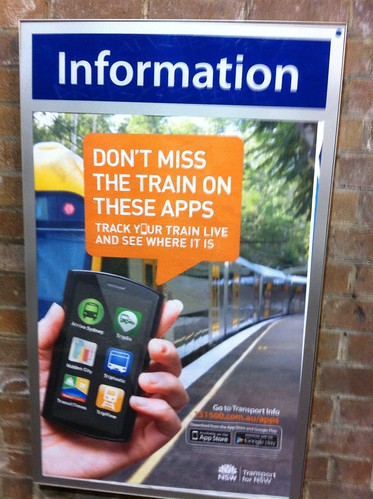
Apps for public transport in Sydney

This was at my local train station. I like the way they are making the information available where I am using public transport. I had seen these on their website, but having this information where people catch public transport is excellent. I have not tried all these apps yet. I had a few strange looks as I was photographing this.

Tuesday, April 23, 2013

Share your story

Record your storyThe Defence of Darwin Experience is an impressive museum.  I am not a regular visitor to museums about war, but occasionally will go to see how they are telling the story.

This museum was very impressive, and highlighted the diversity of the population of Darwin both then and now.

There was excellent use of archival information, with different ways to access the different kinds of stories.  You really could see the Defence of Darwin from a whole lot of angles.

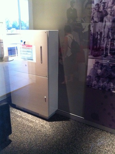
They also had this booth, at the end of the exhibition, where you could add your story.  There were simple instructions and you could obtain help of you needed it.


It seemed a very interesting way to capture oral history information, and to let people know that their stories were of interest.

Museum app

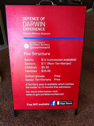
I was also impressed with their free wifi, which when you accessed it, encouraged the downloading of the museum app (which was also mentioned on the sandwich board outside the museum).

They were making it really easy in the museum to find out about what was available online.