Showing posts with label signs. Show all posts
Showing posts with label signs. Show all posts
Tuesday, July 31, 2018
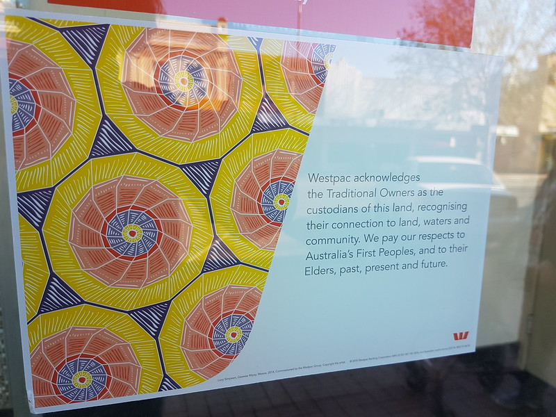
How does your library acknowledge Indigenous people?
I am more frequently seeing signs like this outside banks, however, I am not consistently seeing acknowledgements at libraries. I was wondering how people are addressing this and how you are working with local Aboriginal and Torres Strait Islander people to do so?
Tuesday, April 17, 2018
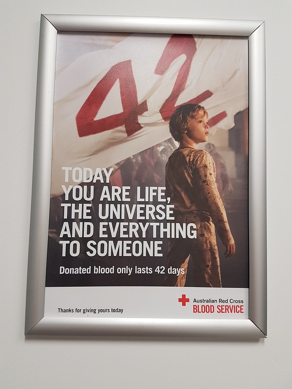
The meaning of life is 42, but does this sign included or exclude?
Do the signs at your library include or exclude?
This was a sign at the blood bank. I have read The hitchhikers guide to the galaxy (a very long time ago), so I thought I knew the quote it was referring to. I may still work if you have not read/watched it (or at least I think it does), because the key point is how long blood lasts (or at least that is how I read it).
There is a however to this. Because I was taking a photograph in the interview room (you have to answer a lot of questions before you can donate blood, plasma or platelets), this started a discussion with the nurse who had not read the book, seen the film or television series. She was commenting on how excited another donor had been seeing the poster. This made me wonder if it was too niche. I think it works even if you don't know that that many of the words form a quote as the key point is blood lasts 42 days so there needs to be continuing donations. It highlights that there can be many ways to read a sign.
Thursday, November 13, 2014
location based encouragement to use social media
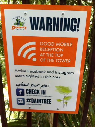
This sign was in the Wet Tropic World Heritage Area. I like the way they let me know the hashtag, while I was onsite, and how I can connect on facebook. They were efficient on Instagram, as the two images I posted using that hashtag were liked within 24 hours (by this group). There was little mobile coverage in this area,(and mostly no mobile coverage further north) so it was a nice way to let people know about it. I have written blog posts about this before, and I really like location based information.
Tuesday, November 11, 2014
anticipation, through signs
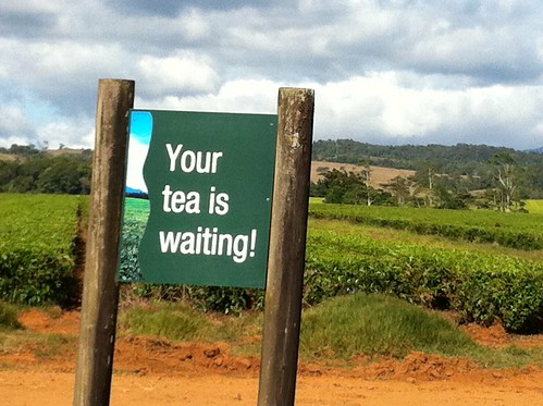
This sign was at the Nerada Tea Estate near Malanda, Queensland. I had been passing other signs which were building anticipation (but not where I could safely photograph them). This one was near the car park, and just hit the spot.
Thursday, November 6, 2014
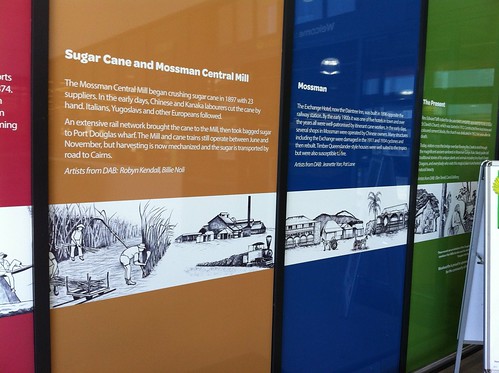
local studies at the supermarket - in Mossman, Queensland
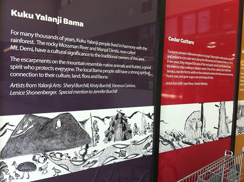
These two photographs show part of the entrance to Woolworths at Mossman in Queensland. I was interested seeing the local studies information as I walked in, as I have not noticed it in other supermarkets. It seemed an interesting inclusion.
Thursday, October 30, 2014
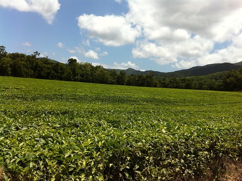
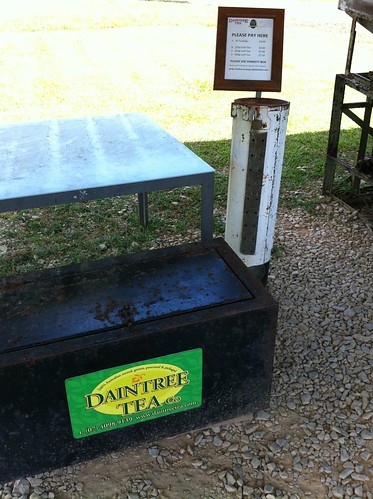
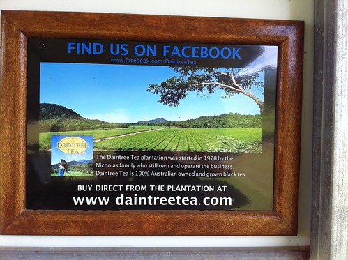
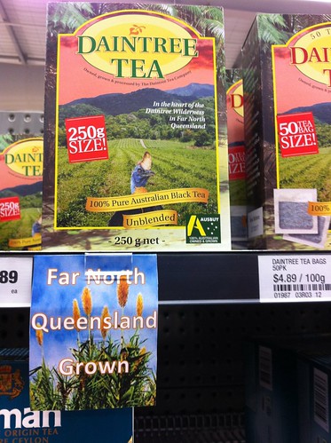
Daintree Tea and location based marketing
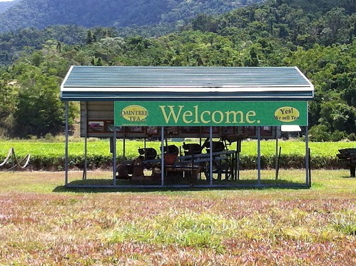
This is what you see when driving to Cape Tribulation.
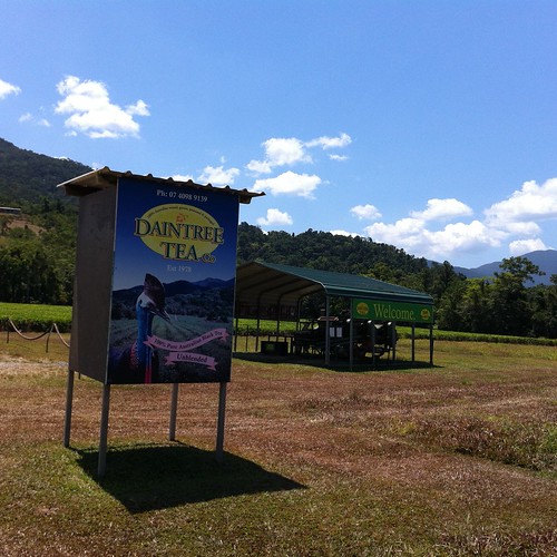
It really is at the tea plantation.
They have an honesty box where you can buy the Daintree Tea (and yes, I bought some here).
They also let you know they are on facebook (at the tea plantation)
Supermarkets (south of the Daintree River) were also letting you know it was local tea
and
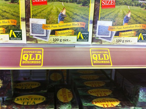
I am including all the photographs of tea and promotion, to show that it does not have to be fancy. I really liked the way the tea was promoted at the tea plantation. I was thrilled there was an honesty box (I had never bought tea this way before). They were taking advantage of the location, and it was in a smart and professional way. It is lovely tea too.
Wednesday, June 18, 2014
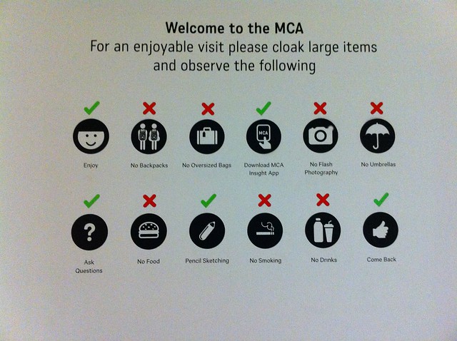
Welcome to the MCA
This is an interesting list of things to do and not do at the Museum of Contemporary Art, Sydney. Enjoy, ask questions and come back :D
Sunday, June 30, 2013
You are approaching the future...
 This sign is at the National Museum in Canberra.
This is one of my favourite museums. They have really really interesting exhibitions, an excellent permanent exhibition and an amazing building. I think the building builds excitement as you walk towards it seeing the curve of orange towering above you. There are lovely views over the lake as well.
This sign is on the way to part of the museum. I thought it was asking an excellent question for the end of blogjune. I thought it was suggesting a proactive rather than a passive approach to the future. It is also suitably ambiguous as we all make and are made by our environments. It seems to require conscious action.
It has been another fun blogjune. I am still catching up with lots of fabulous posts written by many amazing people - so part of my future will be reading more blogjune posts.
I already have a ticket...
 This sign is at the National Gallery in Canberra. It is about their current exhibition which is well worth seeing.
They had more complex information to convey, but it broke into three parts - hence the bigger writing on the sing. This meant that you did not have to read the whole sign, just the part which related to your circumstances.
They were saving your time and giving you the information you needed, easily. There were several of these panels on the way in, so which ever way you approached the gallery you were likely to see them.
I was interested that none of the signs had social media connections, but perhaps I missed them.
The signage for the exhibition was excellent.
Friday, June 28, 2013
Put your sign where it matters
 This sign is encouraging people to download podcasts about the western MacDonnell Ranges, and other national parks in the Northern Territory. This sign is in a location with mobile coverage. This is really sensible.
 Many national parks do not have mobile coverage and it would be really irritating to see this sign in one of those places.
Seeing it where there is mobile coverage, so you could actually download the podcasts is excellent.
Do you have any signs designed to irritate? Or are they like this one, in the right place and even including the url to make it really easy to find the podcasts?
It worked well as a promotion to, letting people know about different places they could go in national parks.
You can see the links to the stories here. (Note there are a few issues about the names of the stories).
I also like the sharing element.
Thursday, June 27, 2013
Is the sign big enough?
 This example was taken from the train station near the Serangoon Library.
This sign was readable so that it was clear that the library was in the shopping centre. It made it very easy to find.
Wednesday, June 26, 2013
apple sign
 I really like this sign. I like it so much that I have blogged about it before. I think it is a great way to let people know about different apple types, and to encourage people to try some different ones. It does not list all apple options, but a range.
It has simple to read graphics and gives useful to read information about apple without being overwhelming.
It is a very nice example of keeping a sign simple.
Tuesday, June 25, 2013
signs to explain services
 Sometimes new services may need an explanation. This sign in Clementi Public Library in Singapore used images and limited text to explain a services which provides surprise reads. The service is a nice idea, as is the sign to explain it to people who may not be sure about borrowing a brown bag (with a book in it) from the library.
Monday, June 24, 2013
Are you sharing your library mission?
 This is from Salt Lake City Public Library. They want people to know the parameters of their library service, and use the library mission statement to make sure people know the expectations upon the library service.
This is an interesting way to tell part of the story of the library.
Sunday, June 23, 2013
Does your sign blend in?
 Sometimes the purpose of the sign is to be part of the scenery. This was a temporary sign at QAGoma. It was part of one of the art works, and was connecting the cafe to the exhibition, but having part of an art work in the cafe, which also operated as a sign.
This was an interesting way of looking at the signs for the exhibition, and of drawing the cafe in to it as well.
think about the language of the sign - should it be in a language other than English
 Many of your library signs will be in English (or whatever is the main language spoken where your library is).
 It may be really important to have signs in languages other than English so that the information reaches the target client group.
This serves a few purposes. It lets people know you have services they may be interested in, in their first language. It also lets people know that you are interested in providing a service in another language and tells the community this.
This sign was in a library where the first language of much of the community is English, however, there are also many people for whom Spanish is their first language.
Friday, June 21, 2013
more connections
 A constant theme in this blog is how can people connect to your organisation, and how can they find out about how to do this.
 Social media connections should be listed (in an easy to find way) on the web site. As they are for the Alice Springs Desert Park.
They also need to be listed on site, as maybe someone has not used your website, or maybe they did not care about connecting until they were onsite.
I was impressed by this sign. It promotes events coming up, but also lets me know three ways I can connect with the park (as well as where the toilets are). All important information. It evens mentions the funding authority (always a good idea).
Do you make it as easy as this for people to find you on social media, when they are in your library?
This is something Vivid did really well - as you can see below.
 They wanted you to connect and they were making it very easy to do.
Thursday, June 20, 2013

Wednesday, June 19, 2013
using signs to tell stories
 These panels were in the foyer of a hotel in Brisbane. They were telling the story of the refurbishment of the rooms, as well as letting you know the colour scheme.
The fabric panels above the beds were stylised maps of the Brisbane River and its path through the city.
I think this information served a few purposes. It was letting people know, while they were still in the hotel foyer, that the rooms were refurbished.
It was also telling the story of Brisbane.
This hotel had river views from many rooms, and they were helping visitors connect from where they were staying, to the city. It was impressive looking at the artwork of the river and then looking out at the river and city.
I liked this idea for a few reasons. The refurbishment was nice, but I really liked being told the story about it as well. It helped me further connect to the environment.
Tuesday, June 18, 2013
Be as blunt as you need to be
 Visits to libraries should not be life threatening.
Visits to national parks may be, because of wildlife and because of people not taking the environment into account.
This is a friendly and blunt sign from Litchfield National Park, NT.
It is blunt, and it needs to be.
Subscribe to:
Comments (Atom)